Redesigning the Yelp App for Increased Functionality.

Overview.
In this two-week long exploratory design project, myself and a team of 5 other students interviewed users about their experiences with Yelp in order to utilize data collected to propose a redesign of the application. After collecting and analyzing the data collected, we proposed a redesign of certain features to increase user-friendliness and limit errors.
My Role.
For this project, my main role was data analyst, and contributed to the writing of the final report, mainly focusing on the trends section. I was in charge of aggregating the interview data collected and creating charts that effectively showcase the interesting trends observed.
Skills.
User Research
Error Analysis
Data Analysis
User Research.
College students were the target demographic for our user research, since we believed that they were key users of Yelp. We asked them a series of questions and tasks to observe any errors that were made. We focused on using the master-apprentice model for the interview, allowing the interviewees to be the masters, and us, the interviewers, to be the apprentice. This way we can ensure that the data collected is relatively unbiased. We screen-recorded all the tasks to be used for retrospective data analysis.
General Questions.
How old are you?
Have you ever used Yelp, and if so, how long?
What do you personally use Yelp for?
List all the features you know Yelp is used for.
What do you look for in choosing a restaurant?
Tasks.
Search up Din Tai Fung.
Share it with a friend.
Make a review. Then delete it.
Add it to a collection.
Check how many friends and who are your friends on Yelp.
Trends.
After collecting, analyzing, and quantifying the data from the 15 interviews, three trends became quite apparent.
We observed three main trends: one, the Yelp app, in general, has low discoverability for its numerous functions, two, many users when making a review took longer to complete the action due to the lack of a clear signifier, and three, users would tend to go the roundabout way to complete an action, taking up more time than needed.
The trends encapsulate users’ frustrations towards the rather confusing Yelp functions.
Low Discoverability.
The first main trend that was discovered was that Yelp has low discoverability when it comes to its numerous functions. Many users were unaware of the rather wide range of tasks that it can do. Yelp is seen as a platform for reviewing not only restaurants, but also service places, such as salons and auto shops, as well as hotels, medical offices, and even schools, just to name a few from their rather lengthy list.
Lack of Clear Signifiers.
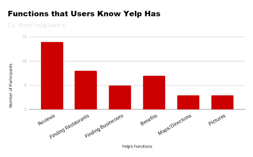
The second trend discovered was that when users are making a review, it took longer to complete the action due to the lack of a clear signifier. Interestingly, based on the graph above, most users utilize Yelp for analyzing reviews, yet leaving and even deleting reviews proved to be quite difficult. This ambiguity and difficulty may cause a reduction in users who are frustrated by the confusing interface of the application. If the Yelp application is primarily used for leaving and viewing reviews, there has to be a better interface design to mitigate this issue.

Roundabout Actions.
The final trend we noticed is that Yelp offers a lot of shortcuts to complete certain actions, such as writing a review or adding a business to a collection; however, users would still go the roundabout way to complete an action, deeming the shortcuts ineffective. 5 out of the 15 interviewees had difficulty locating the sharing button, and they all ended up scrolling down to the “Share this Business” area of the page.

Error Analysis.
Based on the data collected through the interviews, it became evident that users frequently made certain errors when using Yelp. During the interviews, we screen-recorded the users navigating the application, so that we could analyze the errors following the interviews.
Rule-Based Mistake.
Some users made errors when attempting to add a restaurant to a collection. Users were tempted to press the ellipses from prior knowledge of using a similar feature on other applications. Because of this, they performed a rule-based mistake. They understood that they have to press some button to add a restaurant to a collection, they just chose the wrong course of action.
Knowledge-Based Mistake.
When asked to “Make a Review”, users made a knowledge-based mistake since they did not understand the designer’s conceptual model. The users’ review was so short that it was submitted as a tip instead. Because there are no clear constraints that specifically lay out the length for tips versus reviews, this mistake occurred.
Rule-Based Mistake.
When asked to “Check Number of Friends/Check Who Are Your Friends” on Yelp, users made a rule-based mistake because on other applications this is a common convention to press the friends icon to check on who your friends are, and so they followed that same rule. They did the action that they intended to do, it just did not have the result they intended.
Redesign.
Minimizing Errors while Making a Review.
6 out of 15 interviewees made errors while attempting to delete a review. These users clicked the X in the upper right hand corner expecting it to delete the review; however, depending on how many stars they had in their rating, the pop-up to actually remove the review did not always show up . Our redesign is to have a “Save as Draft” icon next to the X button in the upper right corner. The pop-up will always show up, regardless of how many stars the user has inputted in their review. This redesign ensures that users will have visibility of system status.
To accommodate the error of making a tip rather than a review, the text that says “Post Review” should say “Post Tip” when the length of the text is not long enough to be considered a review . This will give the users the knowledge in the world to make an informed decision when posting their tip or review, explicitly telling them which action they will be carrying out and supplementing their mental model.

Increasing Consistency to Minimize Errors.
The next redesign we decided on was restructuring the tabs within the “Me” section. When users were asked to find the number of friends, many either clicked on the wrong section or took a long time to find the correct tab. Our suggestion is to move the categories “Friends”, “Reviews”, “Photos” to the top of the page, in correspondence with those three categories being listed under the profile at the top. This makes the category order more consistent and straightforward for the user. Those tabs would be removed from the “Explore” section further down on the “Me” page. This redesign would simplify the user’s process by increasing consistency, making it more efficient and reducing potential errors.

Making the Yelp Interface Match User Needs.
Our last redesign is adding the distance of the restaurant to the very top of the restaurant page. We asked our interviewees what they considered when picking a restaurant and received answers such as price, type of food, hours open, which are all included at the very top of the restaurant page. 7 out of 15 interviewees also mentioned the distance of the restaurant; therefore, our redesign includes the distance (in miles) at the very top of the section. This redesign is to provide users with the information they want in the fastest way possible.
